

Why Color Matters More Than You Think
When I first picked up a paintbrush for my own apartment, I assumed the biggest decision was finding a hue that matched my furniture. Over time, I discovered that color is a silent architect—shaping mood, influencing productivity, and even guiding how we move through a space. In this post, I’ll walk you through the science behind color psychology, practical steps to translate that knowledge into paint choices, and how to avoid common pitfalls that turn a well‑intended makeover into a visual misstep.
The Neuroscience Behind a Fresh Coat
Our brains process color through a network of photoreceptors and the visual cortex, linking certain wavelengths to emotional responses. For example, blue wavelengths tend to calm the nervous system, while reds can increase heart rate. This isn’t just anecdotal; studies in environmental psychology show that blue rooms can lower blood pressure by up to 5% compared to neutral tones. Understanding these subtle cues lets you design rooms that support the activities you perform there—whether it’s focused work, relaxed reading, or lively entertaining.
Mapping Rooms to Desired States
Before you even open a paint can, ask yourself what emotional backdrop each room should provide. Below is a quick reference guide:
- Home Office: Cool blues or muted greens to foster concentration.
- Kitchen: Warm yellows or soft oranges to stimulate appetite and conversation.
- Master Bedroom: Gentle lavenders or dusty pinks for soothing rest.
- Living Room: Balanced neutrals with accent walls in earthy terracotta for sociability.
- Bathroom: Crisp whites or pale aqua for a spa‑like freshness.
These pairings are a starting point; personal preferences and cultural contexts can shift the balance, so feel free to experiment within the framework.
Choosing Paint Finishes That Complement Color Psychology
Finish matters as much as hue. A high‑gloss finish reflects more light, amplifying the perceived intensity of a color, while matte finishes absorb light, creating a softer, more intimate ambiance. For a calming bedroom, a low‑sheen or flat finish in a muted teal can make the space feel cocooned. In contrast, a semi‑gloss in a vibrant citrus tone can energize a kitchen without overwhelming the senses.
Testing Before You Commit
Even the most well‑researched palette can feel off once applied to an entire wall. I recommend a three‑step testing protocol:
- Swatch Sampling: Paint a 12‑inch square on the wall at three different heights to gauge light interaction throughout the day.
- Live‑In Observation: Live with the swatch for 48 hours, noting any shifts in mood or energy.
- Cross‑Room Comparison: Compare the swatch against adjacent rooms to ensure visual flow.
These steps prevent costly re‑paints and help you fine‑tune the saturation and undertone.
Integrating Sustainable Paints Without Sacrificing Mood
While the psychological impact of color is front‑and‑center, the composition of the paint itself still matters for indoor health. If you’re curious about how paint technology is evolving, check out the latest innovations in low‑VOC and bio‑based pigments. Modern formulations can deliver vibrant, mood‑enhancing colors while maintaining a low environmental footprint—so you don’t have to choose between aesthetics and sustainability.
Layering Color: Using Accent Walls and Trim
Rather than painting every surface the same hue, consider strategic layering:
- Accent Walls: Choose a bold color for one focal wall to create depth without overwhelming the room.
- Ceiling Highlights: A soft sky‑blue ceiling can make a room feel larger and more airy.
- Trim Contrast: Darker trim against lighter walls can frame the space, adding a sense of order.
These techniques allow you to experiment with high‑impact colors while keeping the overall palette balanced.
Data‑Driven Color Selection
Technology is making color decisions more precise. Apps that map room dimensions, natural light exposure, and even user‑submitted mood data can recommend palettes tailored to your lifestyle. For those who love a data‑centric approach, exploring how analytics improve indoor surfaces can inspire similar methods for walls. By feeding in your own observations—like “I feel more focused after a morning coffee in this room”—you can iteratively refine your color strategy.
Common Mistakes and How to Avoid Them
Even seasoned DIYers slip into traps that dilute the psychological benefits of paint. Here are the most frequent errors and quick fixes:
- Over‑Saturation: Using highly saturated hues in large expanses can create visual fatigue. Pair them with neutrals.
- Ignoring Light Direction: South‑facing rooms receive more natural light, often making colors appear brighter; adjust the value accordingly.
- Neglecting Color Harmony: Clashing undertones (e.g., warm orange with cool blue) can feel chaotic. Use a color wheel to find complementary or analogous schemes.
- Skipping Primer: Skipping a quality primer can alter the final shade, especially with light colors over dark surfaces.
Future‑Proofing Your Paint Choices
Homes evolve—rooms become offices, kids grow, and trends shift. Choose pigments that are timeless yet flexible. Earthy neutrals with the option to add bold accent pieces (like removable wall panels or interchangeable artwork) allow you to adapt without repainting. Additionally, consider paints with re‑coatable formulas that make future color changes smoother and more cost‑effective.
Bringing It All Together: A Sample Project Walkthrough
To illustrate the process, let’s walk through a hypothetical living‑room refresh:
- Goal Definition: Create a welcoming space for family gatherings that also supports occasional remote work.
- Color Research: Choose a warm, muted terracotta (stimulates sociability) for an accent wall, paired with a soft ivory matte for the remaining walls (keeps the room bright).
- Finish Selection: Semi‑gloss on the accent wall to reflect light and add visual interest; flat finish on the ivory walls for a cozy feel.
- Testing Phase: Apply swatches at three heights; observe changes from sunrise to sunset.
- Execution: Prepare surfaces with a low‑VOC primer, apply two coats of selected paints, and finish with a protective clear coat on the accent wall.
- Post‑Project Review: After two weeks, note how the space feels during family meals versus work sessions; adjust lighting fixtures if needed.
This systematic approach ensures the final result aligns with both aesthetic desire and psychological intent.
Conclusion: Paint as a Strategic Tool
Home painting isn’t merely a cosmetic update; it’s a strategic lever for shaping daily experiences. By grounding your color choices in neuroscience, testing rigorously, and embracing sustainable technologies, you can turn any room into a purpose‑built environment. The next time you stand before a paint aisle, remember: the brush you hold is a conduit for mood, productivity, and well‑being. Choose wisely, and let your walls speak the language of your life.

Lifan Chen is a freelancer based in Toronto specializing in marketing. With expertise in crafting effective marketing strategies and campaigns, Lifan helps businesses grow their brand presence and reach target audiences. As a Toronto-based freelancer, Lifan combines local market insights with creative marketing skills to deliver tailored solutions for clients.
Related Posts

Painting with Purpose: How to Choose, Prep, and Apply Color for Healthier, More Inspiring Spaces
Learn the art and science of painting with purpose—choose health‑friendly paints, prep surfaces ... Read More
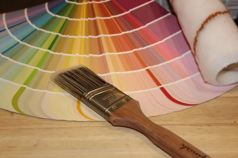
Eco‑Friendly Painting: A Homeowner’s Guide to Sustainable Color
Learn the secrets to eco‑friendly painting: low‑VOC choices, waste‑reducing application tips, ... Read More

Painting with Purpose: How Color Can Transform Your Home’s Mood and Function
Explore how strategic color choices can influence mood, behavior, and health in each room, with prac... Read More
Top Posts

The Rise of Sunrooms: A Sustainable Solution for Modern Homes
Sunrooms are a sustainable solution for modern homes, providing a bright and airy space to relax and entertain while minimizing environmental impact. Learn how ...Read More
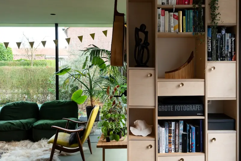
Biophilic Design‑Build: Crafting Living Micro‑Spaces in Modern Offices
A deep dive into the emerging practice of biophilic design‑build, showing how integrating nature‑inspired micro‑environments into offices can deliver meas...Read More

The Strategic Edge of Floor Heating in Modern Workspaces
Floor heating isn’t just a luxury—it’s a strategic asset that improves energy efficiency, employee comfort, and overall ROI. Learn how to integrate smart ...Read More
Painting with Purpose: How Color Can Transform Your Home’s Mood and Function
Explore how strategic color choices can influence mood, behavior, and health in each room, with practical steps, eco‑friendly options, and budget tips for a p...Read More
0 Comments
Post Comment
You will need to Login or Register to comment on this post!