

Painting with Purpose: How Color Can Transform Your Home’s Mood and Function
When I first picked up a paintbrush for my own living room, I thought I was simply covering up a few scuffs. What I didn’t realize was that every stroke was an act of storytelling—a way to shape how the space feels, how it works, and how it welcomes you back at the end of the day. Home painting is far more than a weekend chore; it’s a subtle science that blends art, psychology, and a touch of strategy. In this post, I’ll walk you through the under‑appreciated power of color, share practical steps for choosing the right hues, and reveal a few pro‑tips that even seasoned decorators often overlook.
Why Color Matters Beyond Aesthetics
Most homeowners pick paint based on a trend or a sample that looks good under showroom lighting. But the walls you live inside are constantly exposed to natural light, artificial glow, and the ebb and flow of your daily routines. The pigments you choose can:
- Influence mood: Warm tones like soft terracotta can foster coziness, while cool blues often promote calm and focus.
- Guide behavior: A splash of energizing yellow in a home office can boost creativity, whereas muted greens in a bedroom encourage restful sleep.
- Highlight architecture: Strategic use of contrast can make low ceilings appear higher or narrow corridors feel more spacious.
- Support health: Certain shades are proven to reduce eye strain and improve circadian rhythm alignment.
Understanding these effects lets you paint with intent, turning a simple refresh into a purposeful redesign.
Step 1: Map Your Spaces to Desired Outcomes
Before you even open a paint can, sit down with a notebook and sketch out each room’s primary function. Ask yourself:
- What activities dominate this space?
- What emotional tone do I want to set when I step in?
- How does natural light shift throughout the day?
For example, a family gathering area benefits from an inviting, sociable hue—think muted amber or a warm sage. A study, on the other hand, thrives on concentration‑enhancing neutrals with subtle depth, such as a soft slate or a muted indigo.
Step 2: Dive Into the Science of Color Psychology
Here’s a quick guide to the most commonly used palettes and the feelings they evoke:
- Reds & Oranges: Stimulating, energetic, and perfect for lively spaces like kitchens or playrooms.
- Yellows: Cheerful and optimistic, great for home offices or entryways that need a burst of positivity.
- Blues & Greens: Calming and restorative; ideal for bedrooms, bathrooms, or any zone where you unwind.
- Neutrals (whites, grays, beiges): Versatile backdrops that let furniture and artwork shine, while also offering a timeless feel.
Remember, saturation matters. A deep navy can feel sophisticated but also oppressive if overused. Lightening the shade or pairing it with brighter accents balances the impact.
Step 3: Test Before You Commit
Never underestimate the power of a paint swatch. Paint a 12‑inch square on each wall you’re considering, then live with it for a full day. Observe how the color looks during morning sunrise, mid‑day sun, and evening lamp light. This real‑world test reveals hidden undertones that can make a hue feel either warm or cool depending on the lighting.
Step 4: Consider Finish as a Functional Choice
Gloss levels are often overlooked, yet they affect both aesthetics and durability. Here’s a quick cheat sheet:
- Flat/Matte: Hides imperfections; perfect for ceilings and low‑traffic walls.
- Eggshell/Satin: Slight sheen; ideal for living rooms and bedrooms where you want a soft glow.
- Semi‑Gloss: Resists moisture; best for trim, doors, and bathrooms.
- Gloss: High shine; used sparingly on accent walls or cabinetry for dramatic effect.
Choosing the right finish can extend the life of your paint job and reduce the need for frequent touch‑ups.
Step 5: Blend Paint with Other Surface Treatments
While paint is the star, supporting elements can amplify its impact. For instance, pairing a muted teal accent wall with a modern, texture‑rich wallcovering can add depth without overwhelming the eye. Similarly, integrating a subtle stripe or geometric stencil can break monotony while keeping the space feeling cohesive.
Pro Tip: Use Color to Hide Flaws and Highlight Strengths
Got a wall with uneven plaster? A darker, low‑sheen shade can mask those imperfections. Want to draw attention to a stunning architectural feature, like a fireplace mantle? Lighten the surrounding walls and use a complementary accent hue to make the feature pop.
Creating a Cohesive Palette Across the Home
Even though each room serves a different purpose, a harmonious flow ties the entire house together. Choose a “base” color—often a neutral—that runs through hallways and common areas. Then select “accent” colors that complement the base while reflecting each room’s function. A popular approach is the 60‑30‑10 rule:
- 60% dominant color (walls, large furniture)
- 30% secondary color (upholstery, rugs)
- 10% accent color (pillows, artwork)
This ratio ensures balance without visual chaos.
Eco‑Friendly Paint Options
More homeowners are caring about indoor air quality and sustainability. Look for paints labeled low‑VOC (volatile organic compounds) or Zero‑VOC. These options reduce off‑gassing, making them safer for families, pets, and those with sensitivities. Many manufacturers now offer eco‑friendly palettes that don’t sacrifice richness or coverage.
When to Call in the Professionals
If you’re tackling a high‑ceiling loft, a historic home with delicate plaster, or a space that demands flawless finish for resale value, hiring a professional can be worth the investment. Pros bring expertise in surface preparation, tool selection, and technique that ensures longevity. However, for most standard rooms, a DIY approach—armed with proper prep and patience—delivers beautiful results.
Integrating Paint with Smart Home Ecosystems
While we’re steering clear of “smart” wall trends, there’s a subtle way to let your paint work with technology. Consider installing tiny indoor gardens that double as ambient mood lighting. The natural greens can enhance the calming effect of a blue‑gray wall, and the plant’s health sensors can inform you when to water—creating a living, breathing backdrop that responds to your environment.
Budgeting Your Paint Project
Paint costs can vary widely based on brand, finish, and quantity. Here’s a rough budgeting guide:
- Premium low‑VOC paints: $45–$70 per gallon.
- Mid‑range options: $30–$45 per gallon.
- Basic economy paints: $20–$30 per gallon.
Don’t forget to factor in primer, painter’s tape, rollers, brushes, and drop cloths. A common mistake is skimping on primer, which can lead to uneven color and increased paint consumption. Allocate roughly 10% of your total material budget to primer for best results.
Maintaining Your Fresh Paint
Once your walls are dressed in their new hue, keep them looking vibrant:
- Gentle cleaning: Use a soft microfiber cloth with a mild soap solution. Avoid abrasive scrubbers that can strip the finish.
- Touch‑ups: Store a small can of the exact paint color for future repairs. A quick dab can erase scuffs and keep the wall seamless.
- Humidity control: In damp areas, use a dehumidifier to prevent mildew, which can discolor paint over time.
Final Thoughts: Paint as a Personal Signature
Home painting is a canvas for personal expression, functional design, and even subtle health benefits. By approaching it with intention—mapping each room’s purpose, understanding color psychology, testing samples, and choosing the right finish—you transform walls from mere boundaries into active participants in your daily life.
So next time you stand in front of that empty paint can, remember: you’re not just adding color; you’re crafting an environment that supports who you are and who you aspire to be.

When it comes to the world of blogging and writing, Rose DesRochers is a name that stands out. Her passion for creating quality content and connecting with her audience has made her a trusted voice in the industry. Aside from her skills as a writer and blogger, Rose is also known for her compassionate nature.
Related Posts
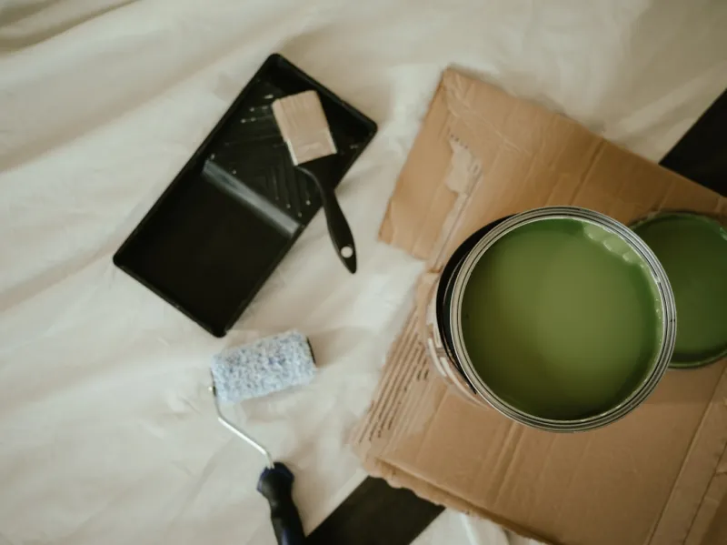
The Power of Paint: How Sustainable Home Painting Can Transform Your Space
Sustainable home painting is a great way to transform your space while reducing your environmental i... Read More

Turn Your Walls into Energy‑Saving Assets with Smart Paint
Learn how modern paint technology can lower heating costs, improve air quality, and transform any ro... Read More

The Impact of Sustainable Practices on Home Painting
Sustainable home painting practices offer a range of benefits, from improved indoor air quality to c... Read More
Top Posts

The Electrician’s Playbook: Trending Sustainable Power Solutions for Modern Homes
Tom Ferguson reveals how electricians are leading the green revolution with smart panels, renewable integration, EV chargers, and LED design, ensuring safety wh...Read More
Elevating Window Treatments: Smart, Sustainable, and Sensory Solutions for Modern Homes
Explore cutting‑edge window dressing strategies that blend technology, sustainability, and design, turning ordinary windows into health‑boosting, energy‑s...Read More
Eco‑Friendly Carpet Cleaning: DIY Solutions That Actually Work
Learn how to clean carpets naturally with enzyme‑rich recipes, protect fibers, and maintain a healthier home—all without pricey chemicals....Read More

The Intelligent Alarm System: Turning Reactive Alerts into Proactive Business Security
A deep dive into the evolution of alarm systems, showing how AI, IoT integration, and community networks transform traditional alerts into proactive, privacy‑...Read More
0 Comments
Post Comment
You will need to Login or Register to comment on this post!